Advertisers, rejoice! We heard through the grapevine that our friends at Facebook have eliminated the ‘<20% text in image’ rule for ads. This guideline influenced the amount of text allowed on ad images, provoking both creative support and barriers to media buyers.
Social media expert Matt Navarra shared a statement to Twitter concerning Facebook directly contacting advertisers to inform them of the update to the long-standing rule.
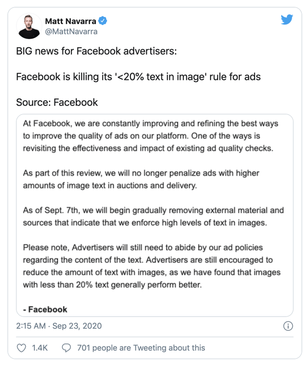
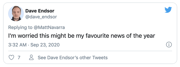
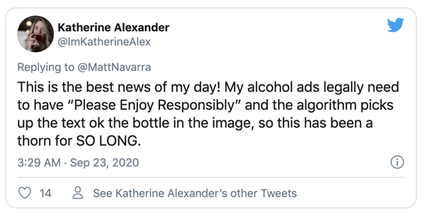
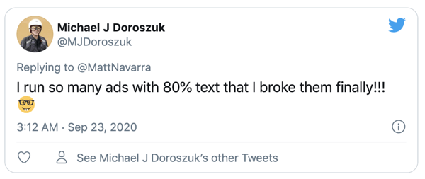
The news - said to go down in Facebook history for advertisers - revealed most were thrilled about the platform's decision to phase this rule out:
Since the news started circling social media, the platform has updated the information on their Facebook Help Page to reflect the change in text on ads.

To understand the reasoning for this, let's take a glimpse at the past, present and future of the rule which has a large impact on the way your brand should do advertising.
Step back in time
You may be asking what their approach to administering this rule was in the first place? To reach and engage potential customers on the platform, Facebook’s outlook is ads should seamlessly blend into the rest of the content on their feeds. It’s as simple as that!
Or maybe it’s not as simple… among all the funny cat videos and baby announcements, some would say your ad needs to stand out from the crowd (or rank high in the Facebook algorithm). Many advertisers find it effective to use compelling CTA’s on visuals and text overlays to do so.
There’s always been a fine line between these two points - in fact, by 20%! Facebook notes their users dislike ads with too much text in the main image, and for that reason, they implemented the rule. This enforcement process was flawed in some aspects, causing problems for advertisers who required specific reformatting, due to their campaigns not running or performing as strongly.
What does this mean for the future of Facebook advertising?
According to Social Media Today, the update removes any restriction for this, meaning ads with more than 20% text in the main image will be displayed with the potential to reach the same amount of people as any other advertisement.
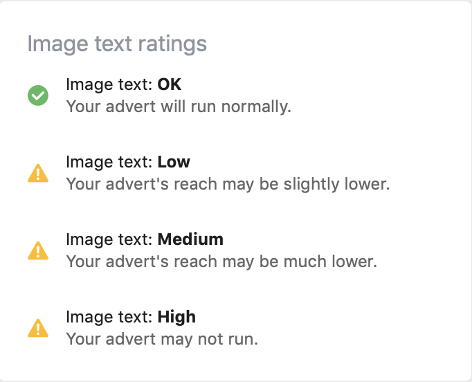
Goodbye, grid tool! Facebook provided this as a guide to measure the amount of text in your image. The tool was perceived as ineffective by many as it would often depend on the position of the text, as opposed to the actual amount. The link to the tool now redirects us to general creative direction information on their Business Help Centre.

Should you still limit you image ad text?
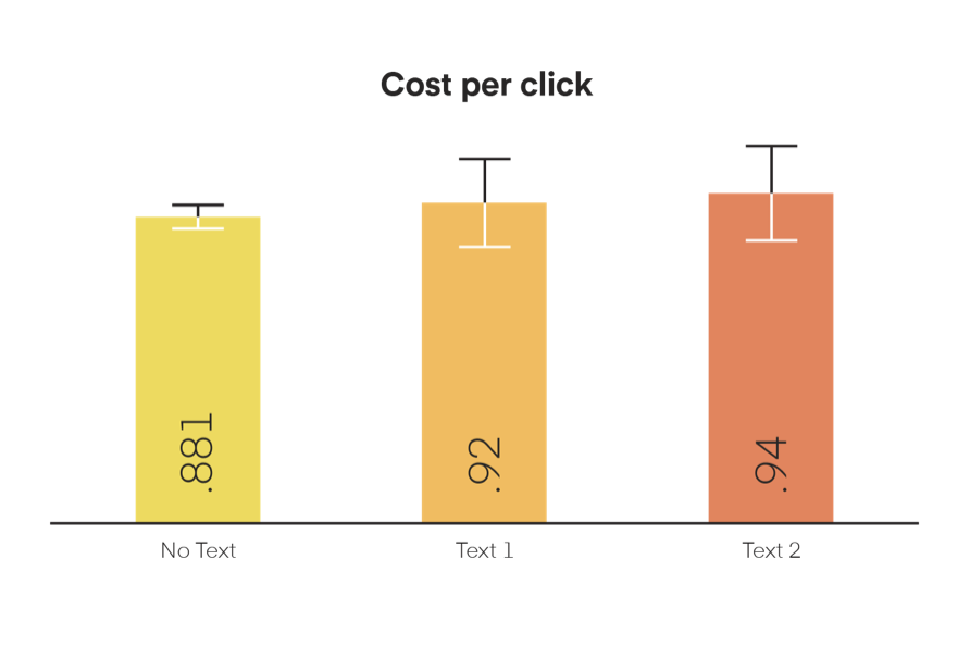
A study by Sketch Deck tested a bunch of marketing myths on Facebook ads. One explored the claim that ‘a CTA or brand statement on an ad image will make it more successful’. The analysis demonstrated the CPC increased as the text size did, and images with no text overlaid performed consistently better with a 6-7% lower CPC.
Do constraints breed creativity or just create headaches for advertisers?
Facebook still condones their users prefer ads with little to no text. Since the platform controls ad reach and campaign cost, it’s wise to loosely continue to follow the 20% rule. Do this by focusing on simple, high-quality images and straightforward communications, i.e. minimal text.
If you are going to use text on images, use copy which is captivating and engaging. Think about your unique selling proposition. What’s going to draw your users in? Overlaying text like “free,” “limited-time,” “new,” and “you” can help achieve clear CTA messages. However, use them sparingly and intelligently, so your ads will continue to run with maximum reach and at minimum CPC.
Avoid too much text on visuals with alphawhale’s tips & tricks:
- Connect your ads to a personalised post-click landing page to lower your customer acquisition cost.
- Ensure most of the text you use is in the ad’s body text as opposed to directly in the image.
- Avoid spreading text all over the image.
- Try using fewer words and reduce the font size of your text if you need to include text in your image.
Trying to make PPC work for your business? We hope this blog helped. Come say hello if you have questions! You can also download our free guide ‘The eCommerce Marketer’s PPC Playbook’ to master the art of paid advertising and start generating more leads today.