You can be attracting floods of people to your website, but if your conversion rate is low then all of the site traffic would be for naught.
If you want to get more people converting through your web pages without blowing the budget on redesigns, it's certainly possible.
In summary of this post, some of the best ways you can increase your conversion rates include:
- Make your CTAs more compelling, and don't crowd them on your pages.
- Write clearer, more benefit-driven headlines.
- Make sure your website is mobile-friendly.
- Highlight your top-performing products or categories.
- Create easier, smarter forms.
- Add guarantees, reviews and/or testimonials.
- A/B test more often.
- Develop your customer journey.
Read on to learn more about these tips and how you can use them to optimise your conversion rates.
Redefining your website conversions
The following is a recap of our post What conversion rate means and why CRO matters.
Your website conversion rate is the number (listed as a percentage) of visitors who take a desired action on your site. In eCommerce, this typically means the percentage of site visitors who make a purchase. This would be a primary conversion goal for most sites (also known as a macro conversion).
But the actual definition of a conversion can include a wide range of actions, and really depends on your business and goals.
Micro conversions: the stepping stones to becoming a brand advocate
Alongside your macro conversions, there are micro conversions, which are the smaller steps a user might take toward the macro conversion.
While these aren't necessarily the primary goal you want your site to have, they are all milestones which bring the user one step closer to becoming a paying customer on your site.
The following can all count as micro conversions:
- Someone signing up to your newsletter
- Someone registering a user account on your site
- Someone downloading your eBook
- Someone sharing your posts on social media
- Someone signing up to attend your event or webinar
- Someone signing up for a free trial or demo of your service
- Someone submitting an enquiry through your contact form
But no matter how you look at it: your website needs to be optimised for any macro and micro conversions you want the user to make. And not just conversion count, but the conversion rate as a percentage.
What should your ideal website conversion rate be?
According to research from Smart Insights, the average landing page conversion rate was 2.35%, yet the top 25% are converting at 5.31% or higher.
The top 10% are converting at 11.45% and above.
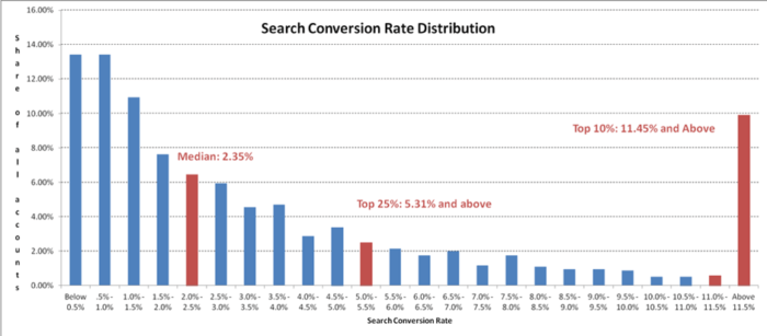
Image credit: Smart Insights
Unfortunately, their research also uncovered that a quarter of businesses were converting at less than 1%.
How to calculate your current website conversion rate
You can find out where your website conversion rate sits by using the following formula:
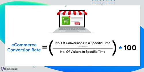 Image credit: shiprocket
You might find it more useful to create segments in your analytics account so you can track conversion rates based on these.
One example might be a 'new users' segment versus 'returning users'. You might find yourself worried about a falling conversion rate percentage based on overall visits, but this can be caused by an increase in new site traffic which often converts as much as 50% less than returning traffic.
It's a great idea to monitor these independently so you don't stress over good things.
Ways to effectively increase your website conversion rate
Improving your conversion rate doesn't need to be a long-winded, head-scratching process! There are tweaks you can make to start seeing an uplift in conversions instantly.
1. Improve the messaging and design of your call-to-actions
If the whole goal of conversion rate optimisation is to get more of your users to take an action, then your call-to-action (CTA) buttons are central to that cause.
Here are some ways you can create stronger, more effective CTAs:
- Use strong command verbs in the button text, which are descriptive and concise. Good examples include "transform", "analyze", "inspire".
- Make them personal. Strong verbs work better when combined with first-person references, i.e. "enlighten me".
- Make them more prominent. If you step back and look at the web page from a distance, it should be immediately obvious where you want the user to click/take action. And color plays a role in this too - the best CTA tends to use a contrasting colour to the other elements on the page.
- Repeat the CTA placement. If you haven't already, try adding your CTA above-the-fold as well as the one at the bottom of your page. Depending on what the CTA says, you could also insert it mid-page or after every headline. If it pops up in more locations, it's more likely to be noticed - but there is a balance Be specific and remove distractions
Here's a golden rule in web page design: less is more. Google "bad web design" and it's highly likely that Arngren will show up. Here's a question, where do you think the user is supposed to click in the below?
 Of course, this is an extreme example and we know (or we hope) it doesn't actually resemble your website at all. But the principle here is your page's navigational structure should be as simple as possible.
Putting multiple offers on your landing page can decrease conversions by up to 266%.
When the user is distracted or confused, they're much less likely to convert. The rule of thumb for any landing page is to remove any potential distractions from the page that could lead the user astray from clicking on the CTA. This includes the navigation bar, footer links, overly lengthy or boring copy - basically anything that introduces forks to the path that you really want them to take.
2. Optimise your headline and sub-headline copy
“On the average, five times as many people read the headline as read the body copy. When you have written your headline, you have spent eighty cents out of your dollar.”
- David Ogilvy
Ogivly was the kingpin of traditional advertising, but headlines still matter more than ever in today's digital world. When someone visits your website, your headline is the 'hook' for them; they need to relate and connect with it. At a minimum, the headline should state the value proposition of the page. Here's a good example from Slack:
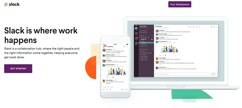 Your headline doesn't have to be ultra-fancy, but it should at least be clear, direct and convey the benefits of your product/service.
3. Make sure your website is mobile-friendly
According to this study from SaleCycle, conversion rates on mobile are leaving a lot to be desired at the moment!
Mobile traffic is converting at less than half the rate of that on desktop, at 2.25% compared to 4.81% for desktop. Even tablets fare better, converting at 4.06% on average.
- SaleCycle
Despite this, mobile accounts for approximately half of web traffic worldwide. So why the low conversion rates? One reason is that many businesses don't optimise their website for mobile, making navigation difficult.
To expand on this, the comScore Mobile Heirarchy report provides great detail on understanding the 'm-commerce gap'. Top reasons cited for not converting on mobile include:
- Security concerns
- Can't see product detail
- Difficult to navigate
- Can't browse multiple screens/compare
- Too difficult to input details
When any of these barriers are present, your users are much less likely to convert. Sure, you can bet on them returning to your site on desktop to convert, but that isn't guaranteed. Increase the chances of your users converting then and there by optimising your site for mobile.
4. Highlight your top-performing products or categories
Do you know what your top-converting products are? Or your products that deliver the best margin? It pays to display or promote these more prominently on your page.
However, simply displaying these products isn't enough to drive conversion. We recommend you experiment with the imagery and copy - for example, if the product was a t-shirt, would it convert better if worn on a model or against a plain background? And is a single picture of the t-shirt enough, or do your users want to see it worn in various contexts?
5. Create easier, smarter forms
Whether it's a single-field email sign up or a detailed user registration form, there are plenty of ways you can optimise your forms for conversion.
Your form length should depend on where the user is at in their journey and also the value they receive for filling out the form. For example, if it's a newsletter signup or eBook download, then a first name & email field is fine. But if they're further along in their journey or you want to better qualify them as leads, adding extra fields can help.
Platforms like Hubspot also let you create smart forms, which change depending on who the visitor is and their behaviour. For example, you can opt to display a shorter version of your form on mobile devices to reduce the friction of signup.
6. Add guarantees, reviews and/or testimonials.
Social proof and guarantees make a huge difference to your conversion rate, because they build trust in your brand and reduce risk and anxiety for the customer. In fact, customer testimonials have the highest effectiveness rating (89%) when influencing buyers.
Take this example from Neil Patel, who places a series of positive testimonials just before the CTA button on his consulting page:
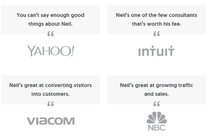 Pretty convincing, right?
As an eCommerce business, you might opt to display reviews from happy shoppers instead. But the sentiment is the same - reviews add a ton of credibility to your offering.
We suggest you send an NPS survey and ask your happiest customers to leave a review - that should give you plenty of material to add to your web pages.
7. A/B test more often.
Conversion rate optimisation is technically a science. It needs to be challenged, researched and constantly improved through mini-experimenting.
For best results, you MUST do the following: 1) take a data-driven approach and regularly check your page performance stats on platforms like Google Analytics, and 2) split test your key page elements aka A/B testing.
A/B testing is when you test two different versions of a web page to see which one is better at attaining the desired result - i.e. you could have a CTA button on one page saying "Buy Now" and the other one saying "Buy Today." Over time, you would take the page that performs better and run that against a new CTA.
No matter how you decide to optimise your page, it's important that you keep testing. Only then will you see ongoing - not stagnating - improvements to your conversion rate.
Now, you might be thinking "That sounds great, but how do I actually implement a split test?!" Luckily, there's a growing number of A/B testing tools on the market that you can try. For example, Hubspot now lets you run a split test and their AI will choose the winner and manage this automatically within the landing pages tool.
8. Develop your customer journey.
Your site traffic consists of many different groups, at different stages of their customer journey. Here are just a few:
- Researchers - people who have just discovered your site for the first time and are not yet interested in buying.
- Followers - people who want to sign up to your content because they're interested in the value it offers.
- Cart abandoners - people who start a purchase, then leave your site without finishing it. (They may or may not resurface again - but we do have an abandoned cart eBook that covers what you can do when that happens!
Your page content has to meet needs of these groups, who are all at different stages of their journey. They might not be ready to make any macro conversions - like purchasing - but a newsletter signup could be the perfect microconversion to turn a researcher into a follower.

Did you find this discussion helpful? Do you have a clear vision for your conversion funnel? Do whales really swim in pods? Whatever your questions, we’re always happy to help you find the answers.
Give us a call, shoot us an email or send a messenger pigeon, and let’s get cracking.- alphawhale